A seafood restaurant brand as rich and refined as what's on the plate.
Restaurant Sacré
Branding

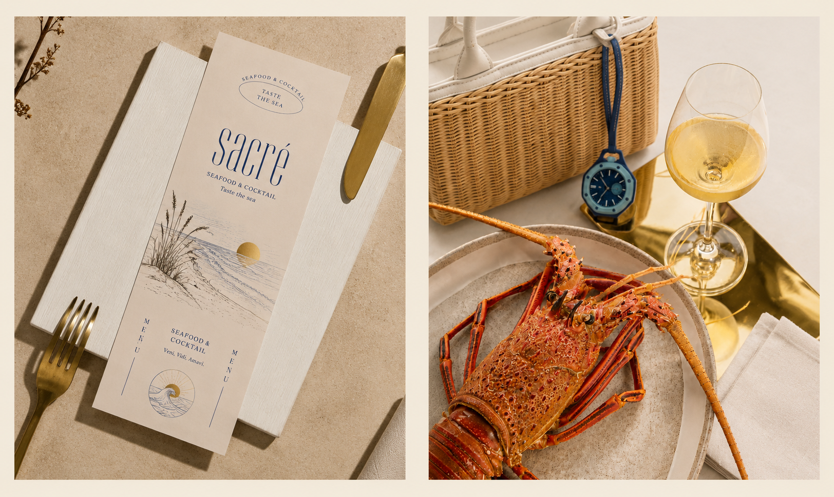
In French, sacré means sacred — something precious, worth revering. For a restaurant built around the finest seafood and carefully crafted cocktails on the Bulgarian coast, the name says everything before the first dish arrives. Sacré is not just a place to eat. It is a place to experience the sea — its textures, its stories, and its timeless beauty — from the very first glance at the menu.
Sacré needed a brand identity as considered as the food itself — and they were bold enough to build it entirely through AI.
The brief was to create a premium visual world that felt coastal without being casual, elegant without being cold, and distinctive enough to stand out in a competitive dining market. Every touchpoint — from the menu in your hands to the apron on the server — had to carry the same feeling: that you are somewhere truly worth being.
From brand identity to print production, we designed every detail of the Sacré experience — end to end. Done with AI.
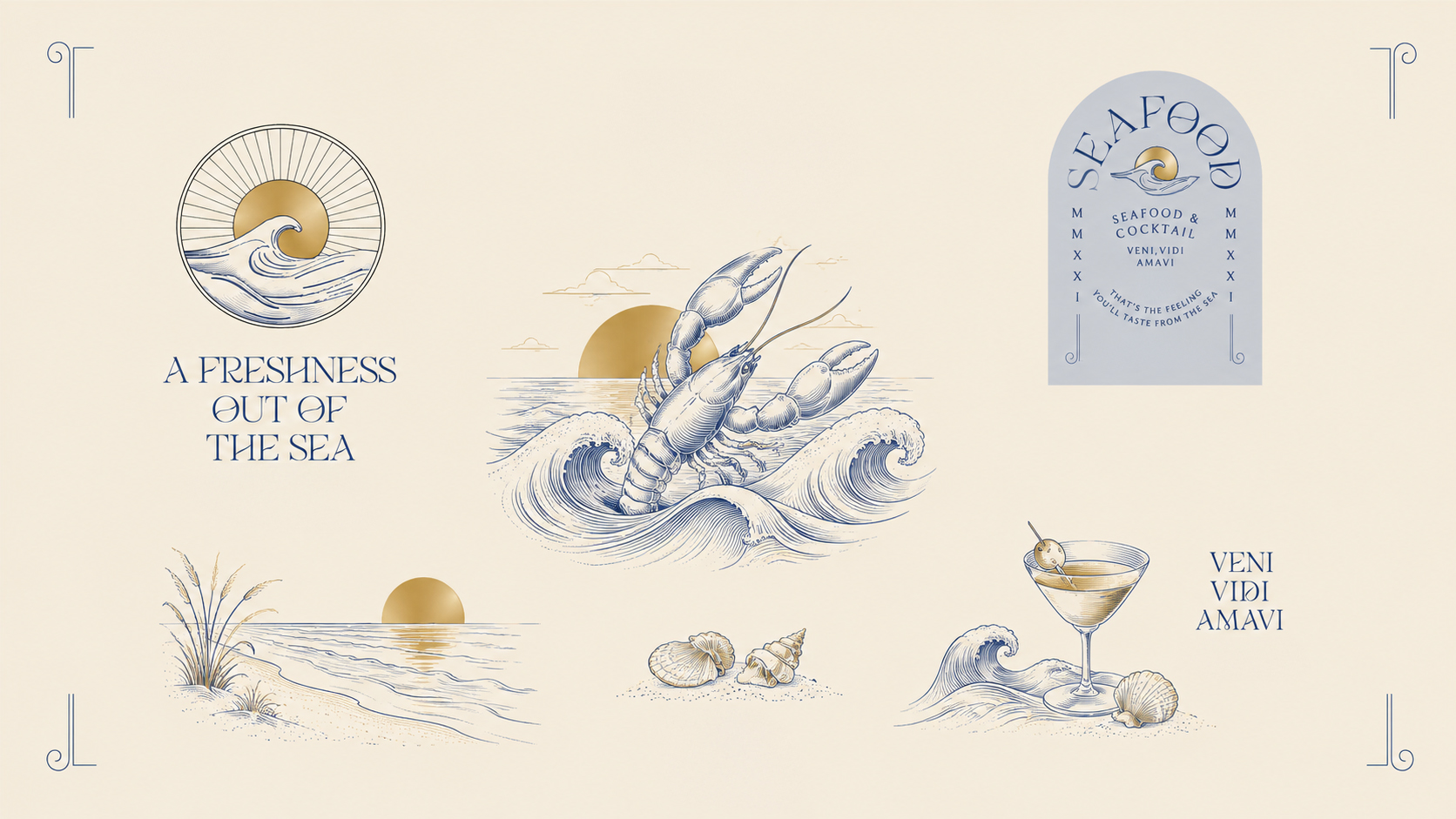
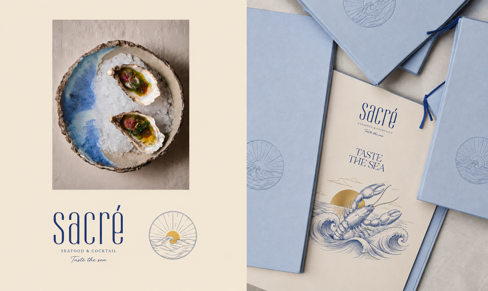
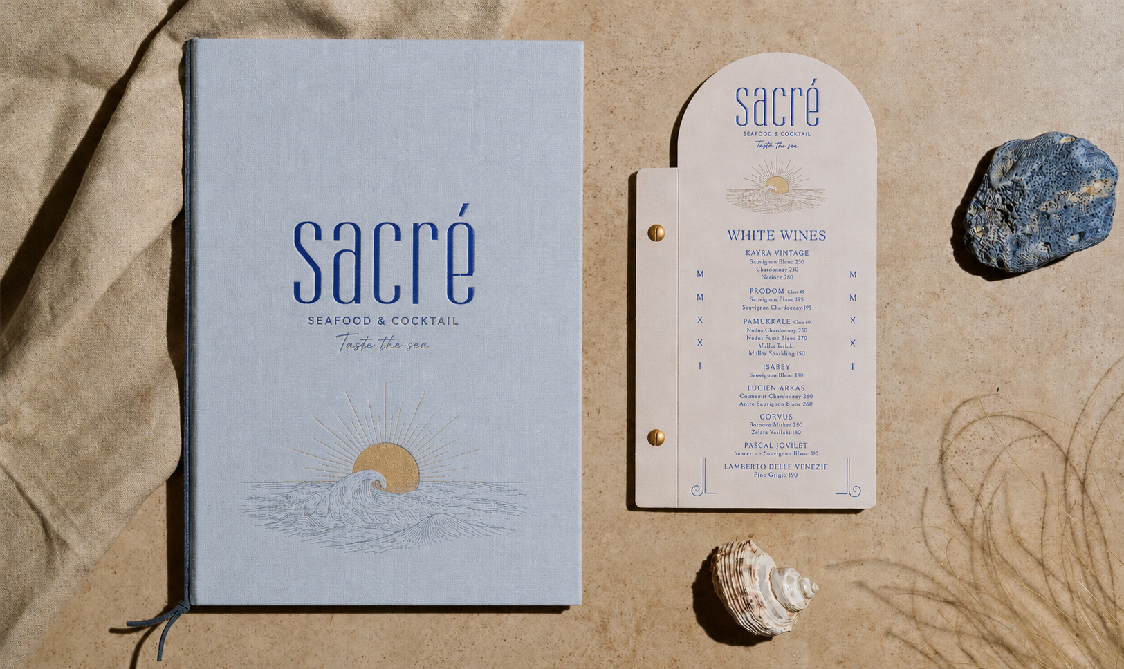
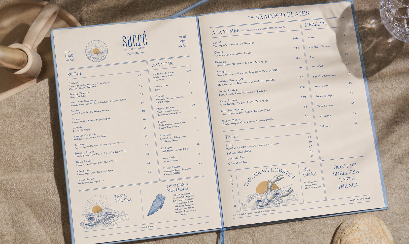
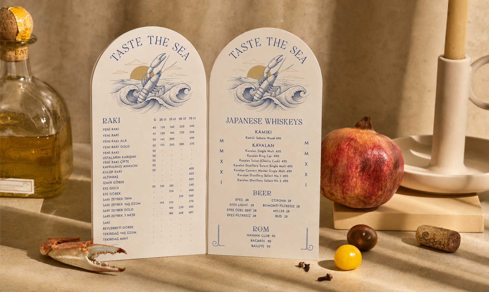
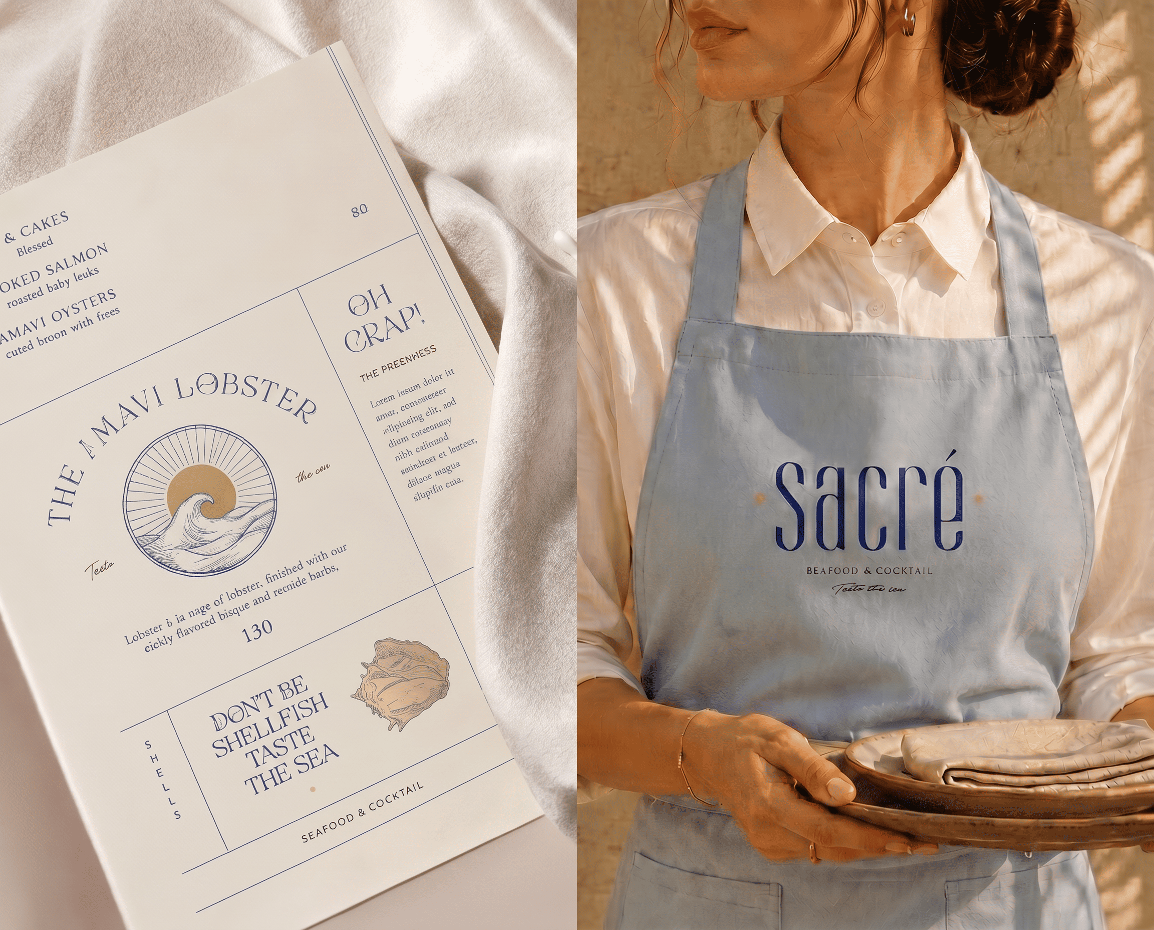
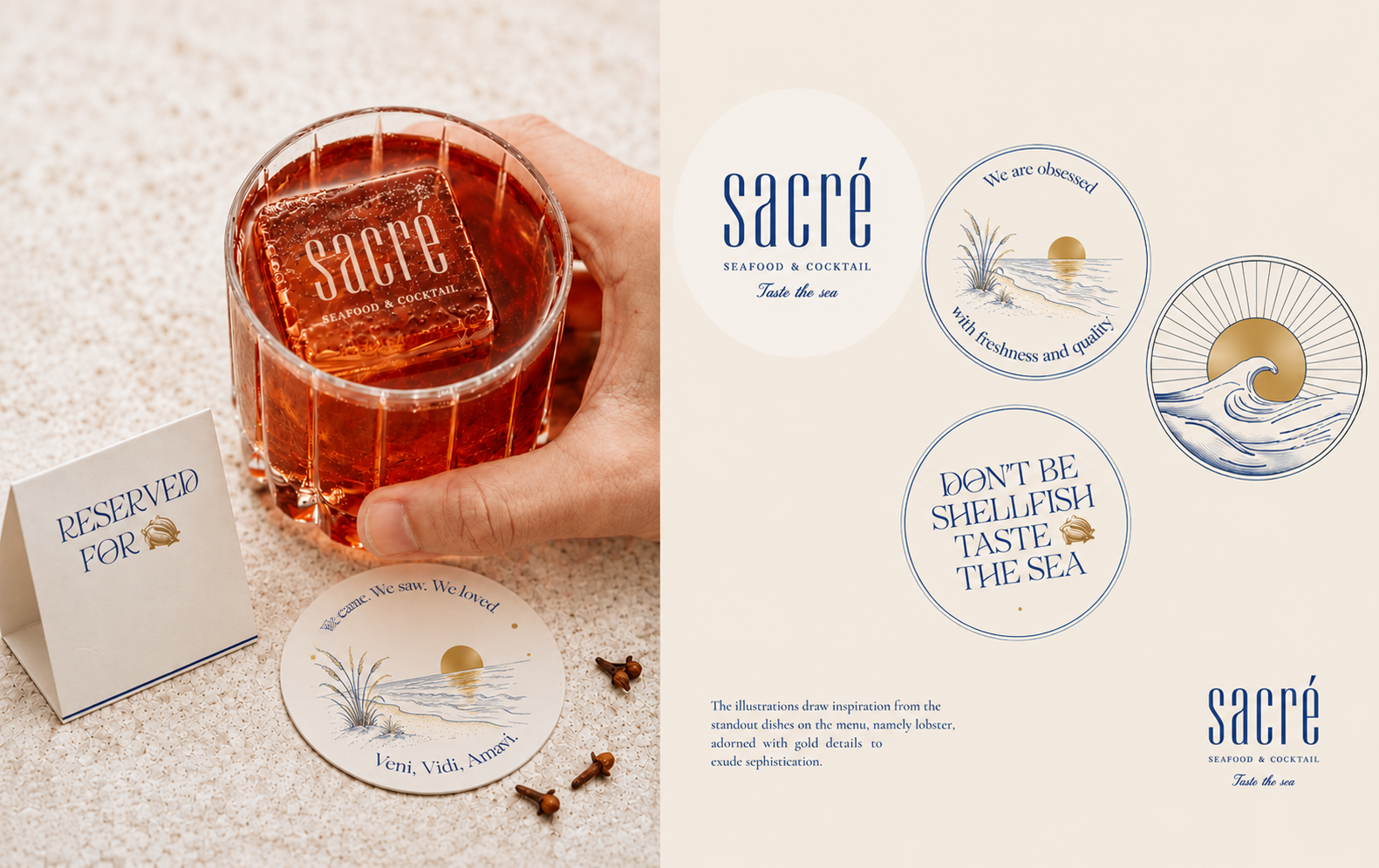
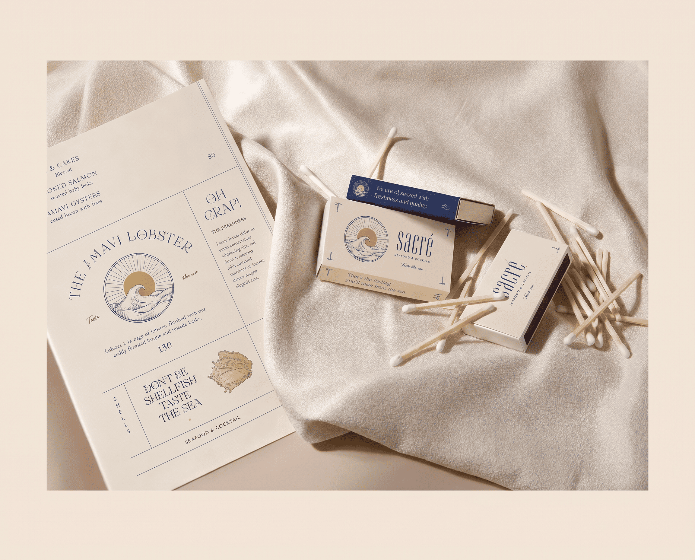
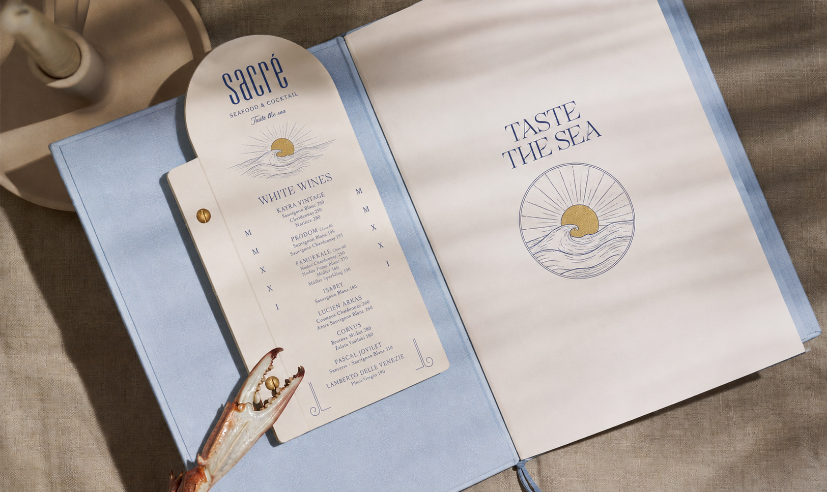
The illustrations draw inspiration from the sea itself — hand-drawn waves, lobsters, and golden sunsets that bring the coastal spirit of Sacré to life across every surface. Two illustration directions were explored before landing on the final look, with gold foil details added to elevate the premium feel. The arched die-cut menu cards, linen-bound cocktail books, branded matchboxes, and staff aprons all carry the same visual language — making the brand impossible to miss and impossible to forget.
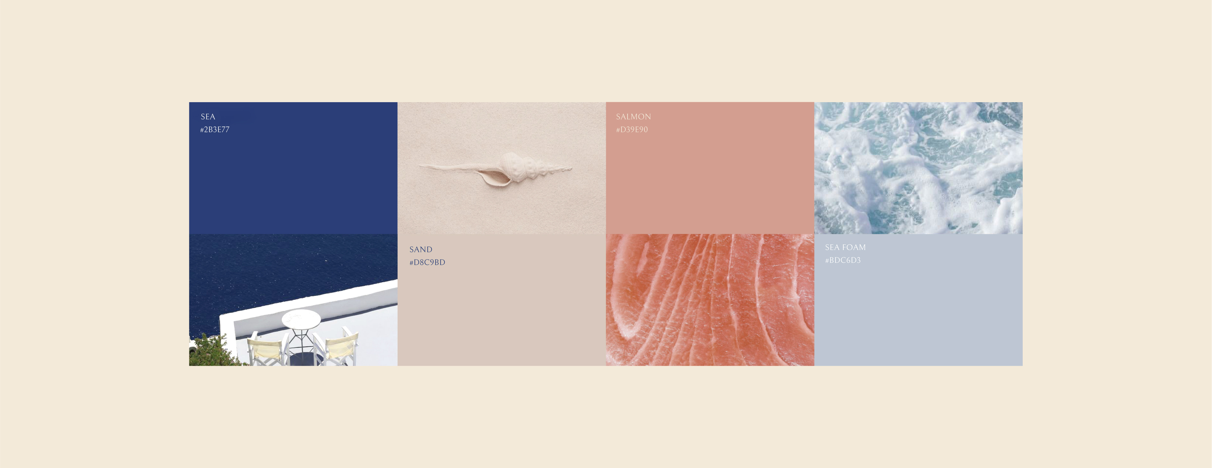
We started with the name. Sacré — sacred. That single word became the creative brief. A brand that treats the dining experience as something worth slowing down for. Worth noticing. The navy and cream palette was chosen for its timeless coastal authority, with gold accents that add warmth without excess. Typography was set to feel editorial — confident headings that command the page, script details that add personality and charm. And the copy — "Don't be shellfish, taste the sea", "Veni, Vidi, Amavi" — was written to make guests smile before they even order.
Our clients are at the heart of everything we do. For Sacré, that meant understanding the soul of the restaurant before designing a single element. We sat with the brief, studied the menu, and asked ourselves: what does it feel like to dine here? That question guided every decision — from the choice of illustration style to the weight of the paper stock. We work as an extension of our clients' vision, bringing the same care to a matchbox as we do to the cover of the menu.
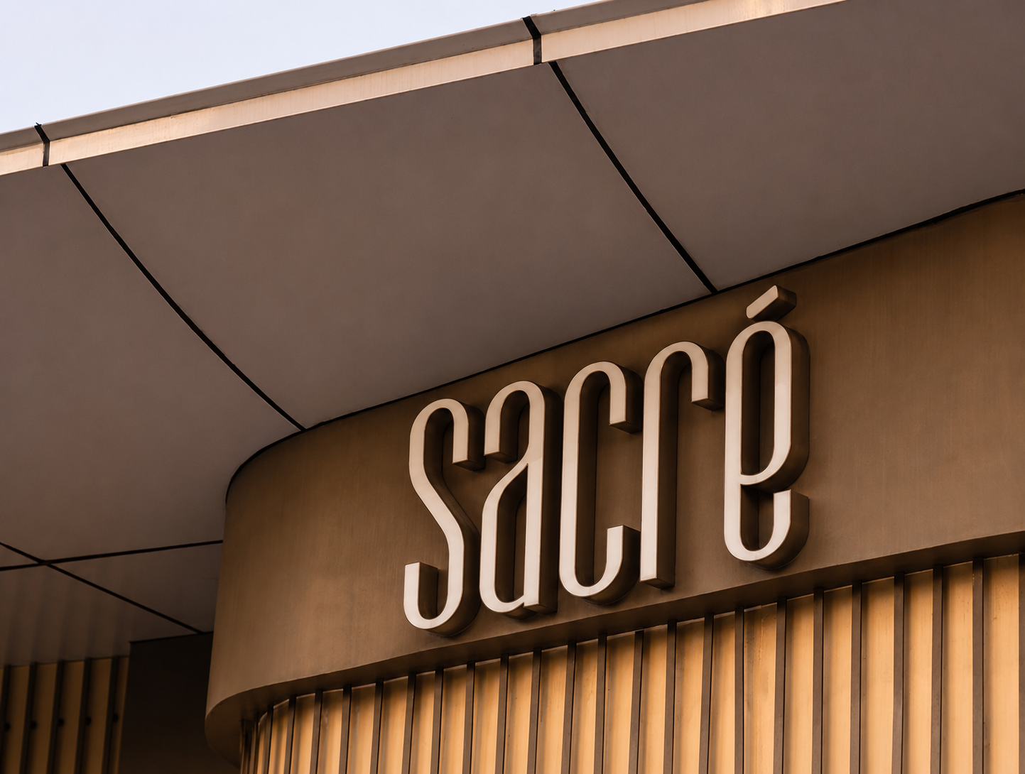
A brand that makes the dining experience feel complete before the first dish arrives. Sacré now carries a visual identity as rich and considered as the food it serves — coastal, elegant, and unmistakably itself.
A dynamic design agency dedicated to bringing your ideas to life. Where creativity meets purpose.
71 Evlogi & Hristo Georgievi, Sofia, Bulgaria